

Erowid Has a New Logo
Apr 30, 2009
Citation: Erowid F. "Erowid Has a New Logo". Erowid.org. Apr 30, 2009. Erowid.org/general/about/about_article10.shtml.
 |
The Logo History
When Erowid first began in 1995, it had no logo. Within a year or so we had created a small logo that looked like a sun crossed with a compass, which was used on the front page of the site. After a few years, that logo was modified to show only portion of the sun/compass and was incorporated into the site header at the top of every page on Erowid.org. We began searching for a new logo graphic in 2001, though repeated attempts failed to satisfy our needs. In 2005 we changed to the more organic, rock art-inspired chalky sun logo and used that in the site's headers, although it doesn't work well in other contexts.The Design Theory
One of the guiding ideas behind the logo search was to create an image that integrated both nature and science. We've always considered this an important intersection in the work that Erowid does...studying pure chemicals as well as plants, communicating with chemists and botanists, talking about scientific research as well as spirituality.There are many ways to try to incorporate these two disparate concepts into a graphic. We tried integrating leaves within geometric shapes or creating geometric shapes out of roots or vines. While we and the dozens of volunteers who helped came up with some interesting ideas, many of the resulting images scaled very poorly; they did not work well at both large and small sizes. The logo needs to be used on the Erowid.org site (medium-small) as well as on items like t-shirts (large), business cards or letterhead (small), or dingbats (tiny).
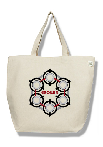
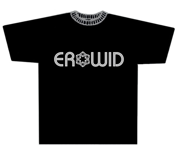
Eventually we had the idea to try working with geometric molecular shapes. The benzene ring is a basic structural component of many organic compounds, including a wide variety of psychoactive chemicals such as DMT, mescaline, MDMA, 2C-B, methamphetamine, and many more. It can be drawn as a hexagonal shape, with circles at the apexes representing carbon atoms. After a great deal of work and playing around with designs, we figured out how to create a stylized flower-like shape that also bears a strong resemblance to a benzene ring.
The new design has the benefit of being very scalable, working well at both a tiny size and at a large size. It also allows for many variations or modifications. It can be black and white or color, it works on both light and dark background colors, and it can have elements added or removed depending on the circumstance. We're pretty happy with the results and will be integrating the new logo into the site and Erowid literature over the upcoming months.
The New "EroLogo" T-shirt
The first place we've used the logo is in the brand new "EroLogo" t-shirt. On the shirt, the logo is used as the "O" in "EROWID". This shirt is now available as a thank-you gift for those who contribute to help support Erowid Center.Development Specifications
Here were some of the design specifications that we used during the development process:- Some mixture of 'scientific' or 'technical' and 'organic' or 'natural'. Possibly digital versus analog, curvy versus angular, or Baroque versus plain.
- Needs to work at four different sizes : very small (~16x16 pixels), small / header (~75x75), medium (small printed contexts, ~300x300), and large (larger than ~800x800). Each of these has different requirements for how complex the figure can be.
- Ideally would work in different color schemes: black&white or two color, three-color, and full color.
- Previous logos have all incorporated sun imagery; some consistency or association with sun imagery is preferred.
- Either done with several different versions or something we could edit ourselves (not requiring the original artist to modify or use in new contexts).
Previous Logo Graphics
| 1996-1999 | 1999-2005 | 2005-2009 |
Each of the previous three logos have had a number of variations. For example, the sun-compass design was used for an electro-luminescent sign (see CoolNeon.com) that we made for Burning Man in 2000. It was used on the top of our dome and as a night-visible street sign. It can be seen attached to the top of the dome in this daytime photo.